


js+css实现图片对比工具 | 🌈采黎创意第2期
最近在看AI绘图方面的内容,发现各大体验网站都有类似的功能——图片对比器;像AI修复老照片、人像动漫化等这些功能,用图片对比器为用户展示效果,体验感更好。今天采黎带大家用css、js来实现图片对比器,欢迎点赞、收藏、一键三连!
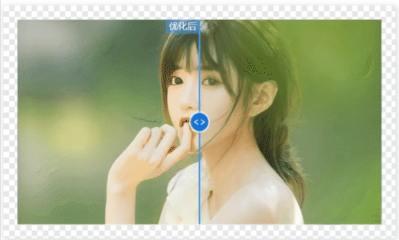
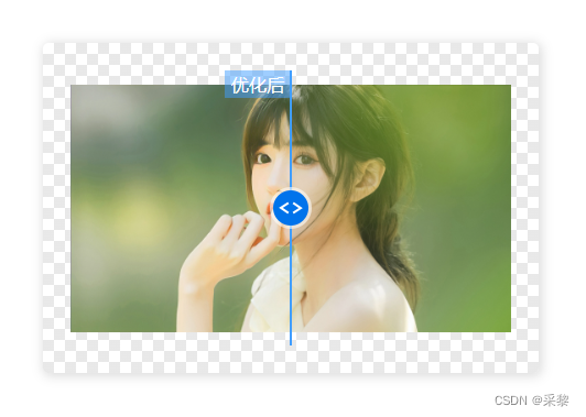
预览
还是老规矩,先上链接~
可以直接预览效果, 或者和采黎一步一步实现,文章内附代码预览
图片对比器-体验地址 🚀🚀🚀
100个创意-体验地址 🚀🚀🚀
github项目地址(欢迎⭐) 🚀🚀🚀
功能分析
- 需要两张图片用于对比,默认两张图片各展示一半。
- 有拖拽控件,拖拽位置的改变,会影响图片的显示区域。
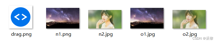
所需素材
我们需要一个拖拽的小图标, 和两张对比的照片
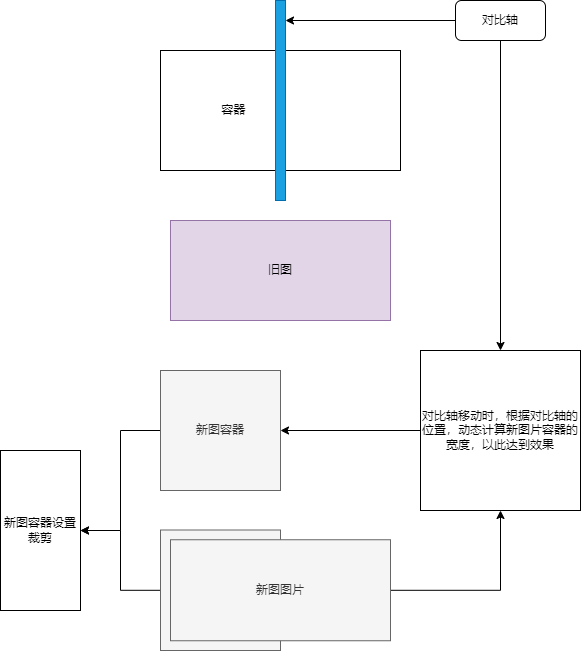
思路
假设两张图为旧图 和 新图,且新图、旧图尺寸一致。
- 用旧图作为底图
- 新图父容器宽为父级容器的一半,定位到左上角,并设置
overflow为hidden - 新图的宽高和旧图保持一致,并定位到左上角
- 拖拽控件时动态计算鼠标的位置,动态设置新图父容器的宽和控件的位置
画个草图来看一下吧
简单实现
我们先来实现一下基础功能;先预设一下基础数据
- 图片宽为320px
- 对比轴控件为30px
1. 实现布局
.img-container设置width: fit-content宽度为自身实际宽度.old-img元素进行占位,以此撑开父容器宽高.new-wrap新图容器绝对定位,宽度为父容器的一半#control元素绝对定位并居中,宽度为30px
<div class="img-container">
    <img class="old-img" src="./img/o2.jpg" alt="">
    <div id="newWrap" class="new-wrap">
        <img class="new-img" src="./img/n2.jpg" alt="">
    </div>
    <div id="control">
        <div></div>
        <img src="./img/drag.png" alt="">
    </div>
</div>
下面是具体样式代码
.img-container {
    position: relative;
    width: fit-content;
    background: #fff;
    margin: 0 auto;
    overflow: hidden;

    .old-img {
        width: 320px;
        height: auto;
    }

    .new-wrap {
        position: absolute;
        width: 160px;
        height: 100%;
        left: 0;
        top: 0;
        overflow: hidden;
        z-index: 10;

        .new-img {
            width: 320px;
            height: auto;
        }
    }

    #control {
        position: absolute;
        width: 30px;
        height: 100%;
        top: 0;
        left: calc(50% - 15px);
        cursor: pointer;
        z-index: 10;

        > div {
            width: 2px;
            height: 100%;
            background: #409eff;
            margin: 0 auto;
        }

        > img {
            position: absolute;
            width: 30px;
            left: 0;
            right: 0;
            top: 0;
            bottom: 0;
            margin: auto;
            z-index: 10;
        }
    }
}
2. 实现拖拽
获取 control 元素,监听鼠标按下事件,并在按下事件中注册监听鼠标移动、抬起事件
const control = document.getElementById("control");

control.addEventListener("mousedown", (e) => {
   document.addEventListener("mousemove", onMouseMove);
   document.addEventListener("mouseup", onMouseUp);
});
鼠标抬起后清除鼠标移动、抬起事件
function onMouseUp() {
   document.removeEventListener("mousemove", onMouseMove);
   document.removeEventListener("mouseup", onMouseUp);
}
鼠标移动时动态计算当前鼠标位置,设置控件位置及新图宽度
function onMouseMove(e) {
   e.preventDefault();

   /* 计算鼠标距离当前父元素左侧的距离 */
   const contentLeft = imageContainer.getBoundingClientRect().left
   let offsetX = e.clientX - contentLeft;

   /* 边界检测,最小为0, 最大为3320px(图片的宽度) */
   if (offsetX < 0) offsetX = 0
   if (offsetX > 320) offsetX = 320

   /* 设置控件的位置,要考虑到控件自身的宽度 */
   control.style.left = `${ offsetX - 15 }px`;
   /* 设置新图容器的宽度 */
   newWrapDom.style.width = offsetX + "px";
}
ok, 我们先看下效果
使用场景
在正常的业务场景,诸如AI修复旧照片、AI人像动漫等;我们无法预知用户要处理的图片比例,可能很长、很宽,图片大小都是不固定的,我们应该规避并处理这些可能出现的问题。
很显然,我们上面简单实现的功能是不能满足业务需求的,接下来我们调整下实现思路。
实现思路
- 设置初始容器宽高
- 对
旧图进行长边适配,并绝对定位在容器中心,新图保持一致
1. 重构布局
初始化时先不给图片src赋值
<div id="imgContainer" class="img-container">
    <img id="oldImg" class="old-img" src="" alt="">
    <div id="newWrap" class="new-wrap">
        <img id="newImg" class="new-img" src="" alt="">
    </div>
    <div id="control">
        <div></div>
        <img src="./img/drag.png" alt="">
    </div>
</div>
2. 样式调整
- 设置
.img-container容器宽高为300px * 200px - 调整
.old-img旧图元素为固定定位,宽设为1px,减少渲染耗时 - 其他样式未发生改变
.img-container {
    width: 320px;
    height: 200px;

    .old-img {
        position: absolute;
        width: 1px;
        top: 0;
        right: 0;
        bottom: 0;
        left: 0;
        margin: auto;
        z-index: 1;
    }

    .new-wrap {
        width: 50%;

        .new-img {
            position: absolute;
            width: 1px;
        }
    }
}
3. 逻辑调整
- 获取所需元素
const imageContainerDom = document.querySelector("#imgContainer");
const oldImgDom = document.querySelector("#oldImg");
const newWrapDom = document.querySelector("#newWrap");
const newImgDom = document.querySelector("#newImg");
const controlDom = document.querySelector("#control");
- 设置新图、旧图的图片链接
oldImgDom.src = './img/o2.jpg'
newImgDom.src = './img/n2.jpg'
- 图片加载完成后,根据容器宽高计算图片宽高及位置(长边适配)
oldImgDom.onload = () => {
   /* 获取图片原始宽高 */
   const imgOriginalW = oldImgDom.naturalWidth
   const imgOriginalH = oldImgDom.naturalHeight

   /* 长边适配,计算图片缩放比例 */
   const imageContainerRatio = imageContainerDom.offsetWidth / imageContainerDom.offsetHeight
   const imgRatio = imgOriginalW / imgOriginalH

   if (imageContainerRatio >= imgRatio) {
      const imgW =  (imageContainerDom.offsetHeight / imgOriginalH) * imgOriginalW;

      /* 设置新图、旧图宽高 */
      oldImgDom.style.width = imgW + 'px'
      oldImgDom.style.height = imageContainerDom.offsetHeight + 'px'
      newImgDom.style.width = imgW + 'px'
      newImgDom.style.height = imageContainerDom.offsetHeight + 'px'

      /* 设置新图位置 */
      newImgDom.style.left = (imageContainerDom.offsetWidth - imgW) / 2 + 'px'
      newImgDom.style.top = '0'
   } else {
      const imgH = (imageContainerDom.offsetWidth / imgOriginalW) * imgOriginalH;

      /* 设置新图、旧图宽高 */
      oldImgDom.style.width = imageContainerDom.offsetWidth + 'px'
      oldImgDom.style.height = imgH + 'px'
      newImgDom.style.width = imageContainerDom.offsetWidth + 'px'
      newImgDom.style.height = imgH + 'px'

      /* 设置新图位置 */
      newImgDom.style.left = '0'
      newImgDom.style.top = (imageContainerDom.offsetHeight - imgH) / 2 + 'px'
   }
}
- 监听鼠标拖拽,计算控件位置、新图容器宽度
function onMouseMove(e) {
   e.preventDefault();

   /* 计算鼠标距离当前父元素左侧的距离 */
   const contentLeft = imageContainerDom.getBoundingClientRect().left
   let offsetX = e.clientX - contentLeft;

   /* 边界检测,最小为0, 最大为容器的宽度) */
   if (offsetX < 0) offsetX = 0
   if (offsetX > imageContainerDom.offsetWidth) offsetX = imageContainerDom.offsetWidth

   /* 设置控件的位置,要考虑到控件自身的宽度 */
   controlDom.style.left = `${ offsetX - controlDom.offsetWidth / 2 }px`;
   /* 设置新图容器的宽度 */
   newWrapDom.style.width = offsetX + "px";
}
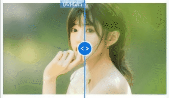
ok,现在已经满足的正常的业务场景了
优化
兼容移动端
用户访问的设备不同,兼容移动端还是很有必要的
之前我们只监听了鼠标的按下、抬起、移动等事件,现在我们再补充下移动端的触摸事件
/* 触摸拖拽 */
controlDom.addEventListener("touchstart", (e) => {
   document.addEventListener("touchmove", onMouseMove);
   document.addEventListener("touchend", onTouchend);
});

function onTouchend() {
   document.removeEventListener("touchmove", onMouseMove);
   document.removeEventListener("touchend", onTouchend);
}
再判断下当前是鼠标事件还是触摸事件,相对的鼠标、触摸位置也是不一样的
const clientX = e.type === 'touchmove' ? e.touches[0].clientX : e.clientX
优化新旧图提示
加一个提示元素
<div id="tip" class="tip">优化后</div>
对其进行定位,让提示在顶部,对比轴的左侧
.tip {
    position: absolute;
    width: 48px;
    height: 20px;
    top: 0;
    left: calc(50% - 48px);
    display: flex;
    align-items: center;
    justify-content: center;
    background: #409eff80;
    font-size: 13px;
    color: #fff;
    z-index: 10;
}
处理移动时候的位置
const tipDom = document.querySelector("#tip");

/* 设置提示框位置 */
tipDom.style.left = `${ offsetX - tipDom.offsetWidth }px`;
ok,我们看下效果
优化容器背景
为对比器容器外层加一个 .main-img元素
<div class="main-img">
为它设置一个像素背景
.main-img {
    width: fit-content;
    padding: 20px;
    margin: auto;
    border-radius: 4px;
    box-shadow: 1px 1px 8px 1px #dcdcdc;
    background-position: 0 0, 8px 8px;
    background-size: 16px 16px;
    background-image:
            linear-gradient(45deg, #ddda 25%, transparent 25%, transparent 75%, #ddda 75%, #ddda),
            linear-gradient(45deg, #ddda 25%, transparent 25%, transparent 75%, #ddda 75%, #ddda);
}
看下效果
优化对比器初始化
先做一个loading效果
<div id="loading" class="loading"></div>
做个小动画
.loading {
    display: none;
    position: absolute;
    height: 100%;
    left: 0;
    top: 0;
    z-index: 100;
    background: linear-gradient(#ffffff, #409eff, #ffffff);
    animation: loading 1.4s linear infinite
}

@keyframes loading {
    0% {
        width: 0
    }

    100% {
        width: 100%;
        opacity: 0.1
    }
}
看下效果

在初始化时,显示loading效果,隐藏对比轴、提示元素,图片加载完成后再显示,并隐藏loading效果。
const loadingDom = document.querySelector("#loading");

loadingDom.style.display = 'block'
controlDom.style.opacity = 'none'
tipDom.style.opacity = 'none'

oldImgDom.onload = () => {
    setTimeout(() => {
       loadingDom.style.display = 'none'
       controlDom.style.opacity = 'block'
       tipDom.style.opacity = 'block'
     }, 500)
}
设置控件用了opacity,是因为在初始化的时候需要获取控件的宽度,不能用overflow
自适应
到现在,这个图片对比器已经能满足大多数业务场景;但有些场景下还是需要自适应的,所以我们把这个功能也补一下。
关于自适应容器,移步这篇 2023年CSS自适应正方形必须拿下🏆
我们把main-img容易的宽度设为100%, .img-container容器要做下调整,比如当前容器宽高比为16:9
.img-container {
    position: relative;
    /* 宽高比为16:9 */
    width: 100%;
    padding-top: 56.25%;
    margin: 0 auto;
}
然后把之前写的业务逻辑封装成 init 函数,每次调用时重置控件、提示元素位置
const init = (oldImg = './img/o2.jpg', newImg = './img/n2.jpg') => {
   loadingDom.style.display = 'block'
   controlDom.style.display = 'none'
   tipDom.style.display = 'none'

   oldImgDom.src = oldImg
   newImgDom.src = newImg

   oldImgDom.onload = () => { /* 内部逻辑 */ }

   /* 初始化时重置控件位置 */
   controlDom.style.left = `${ imageContainerDom.offsetWidth / 2 - controlDom.offsetWidth / 2 }px`;
   tipDom.style.left = `${ imageContainerDom.offsetWidth / 2 - tipDom.offsetWidth }px`;
   newWrapDom.style.width = imageContainerDom.offsetWidth / 2 + "px";
再监听下屏幕尺寸的变化,初始化对比器,加上函数防抖。
/* 初次调用 */
init()

let timer = null
window.addEventListener("resize", () => {
   if (timer) clearTimeout(timer)

   timer = setTimeout(() => init(), 200)
});
好了,现在一个完整的图片对比器就做好啦,我们看下效果。
记得一键三连哦,相信采黎,这个工具总会用到的。
关于开源
最近时间比较赶,仓库的描述文档和预览页面还未整理;这些会一点一点补起来的,有兴趣的小伙伴可以订阅、star哦!
往期创意
余音
文章若有不对的地方,请及时指正!祝大家1024节快乐,再会!


 3544
3544


 被折叠的 条评论
为什么被折叠?
被折叠的 条评论
为什么被折叠?
 到【灌水乐园】发言


