Welcome to the nteract components documentation! On this web page, you'll find examples of how to use the React components within the nteract ecosystem to build your own custom user interfaces. These docs will showcase best practices, example implementations, and provide details on how you can use different React components together to build your own notebook, console, or other unique interactive computing experience.

If you experience any problems with this docs, please file an issue.
import Cell from '@nteract/presentational-components/src/components/cell';
import { Cell } from "@nteract/presentational-components";

All by itself, this component doesn't do anything. Used with <Input />, <Source />, and <Outputs />, it brings styling to the children based on hover and selected states.

By moving a cursor over the component and hovering, styling can be changed.

[1]
import pandas as pd
pd.DataFrame([1,2,3])

# Alternate between hovering the cursor over this cell and outside of the cell
0
01
12
23

A <Cell /> can be set as selected to raise it up.

[2]
print("Hello World")
Hello World

A cell can be in one of three levels, similar to raised cards:

  1. Flat on the "page"
  2. Slight rise, mid way to fully active, while hovering (_hovered prop is true)
  3. Raised up highest, when fully active (i.e. isSelected prop is true) -- the editor should be focused when this level is used
[ ]
# Level 0 - Flat
Output
[ ]
# Level 1 - Slight
Output
[ ]
# Level 2 - Raised
Output
import Cells from '@nteract/presentational-components/src/components/cells';
import { Cells } from "@nteract/presentational-components";

<Cells /> is a wrapper component to provide buffers between cells if you're building a notebook app.

[1]
import pandas as pd
[2]
df = pd.DataFrame([1,2,3])
display(df)
0
01
12
23
[*]
import time
time.sleep(9001)
import Error from '@nteract/presentational-components/src/components/error';
import Input from '@nteract/presentational-components/src/components/input';

The Input component is a container component that serves as a container for the Input of a cell.

import { Input } from "@nteract/presentational-components"

The Input component provides a hidden prop which you can use to dictate whether or not the children of the container are rendered. The default value is set to false, so you'll see the text "You can see this." rendered here.

You can see this.

You can also set the hidden prop to true to hide all children. Take a look at the code for the component below to see how.

Since the Input component serves as a light container for its children, you'll most often need to use this component in conjunction with the Prompt and Source components, as seen below. You can learn more about Prompt here and Source here.

[ ]
import Outputs from '@nteract/presentational-components/src/components/outputs';

Outputs is a container component for rendering the output of a particular cell. The output is response returned from the kernel as a result of the execution of a particular code cell.

import { Outputs } from "@nteract/presentational-components"

Similar to the Input component, the Outputs component exposes a hidden prop that you can use to determine whether or not to display the children of the presentational component. The hidden prop defaults to false, as you can see by viewing the source below.

You can see this.

But can be set to true as in the example below.

Outputs also exposes an expanded flag which can be used to dictate whether the children of the container component should be collapsed or expanded to display all outputs. This is a useful prop to use when you want to limit or show the amount of information that is shown from large outputs. The expanded prop will default to false and collapse the contents of the cell.

You can use the expanded prop in conjunction with the collapsed property on cells within a Jupyter Notebook. This allows you to persist the state of an output and read from the persisted value.

When the expanded prop is set to false, you'll see an output like so.

stdout line 0
stdout line 1
stdout line 2
stdout line 3
stdout line 4
stdout line 5
stdout line 6
stdout line 7
stdout line 8
stdout line 9
stdout line 10
stdout line 11
stdout line 12
stdout line 13
stdout line 14
stdout line 15
stdout line 16
stdout line 17
stdout line 18
stdout line 19
stdout line 20
stdout line 21
stdout line 22
stdout line 23
stdout line 24
stdout line 25

When it is set to true, you can see the entirety of the output without needing to scroll.

stdout line 0
stdout line 1
stdout line 2
stdout line 3
stdout line 4
stdout line 5
stdout line 6
stdout line 7
stdout line 8
stdout line 9
stdout line 10
stdout line 11
stdout line 12
stdout line 13
stdout line 14
stdout line 15
stdout line 16
stdout line 17
stdout line 18
stdout line 19
stdout line 20
stdout line 21
stdout line 22
stdout line 23
stdout line 24
stdout line 25

You'll most likely use the Outputs container component in conjunction with the components documented in Outputs below.

import Pagers from '@nteract/presentational-components/src/components/pagers';

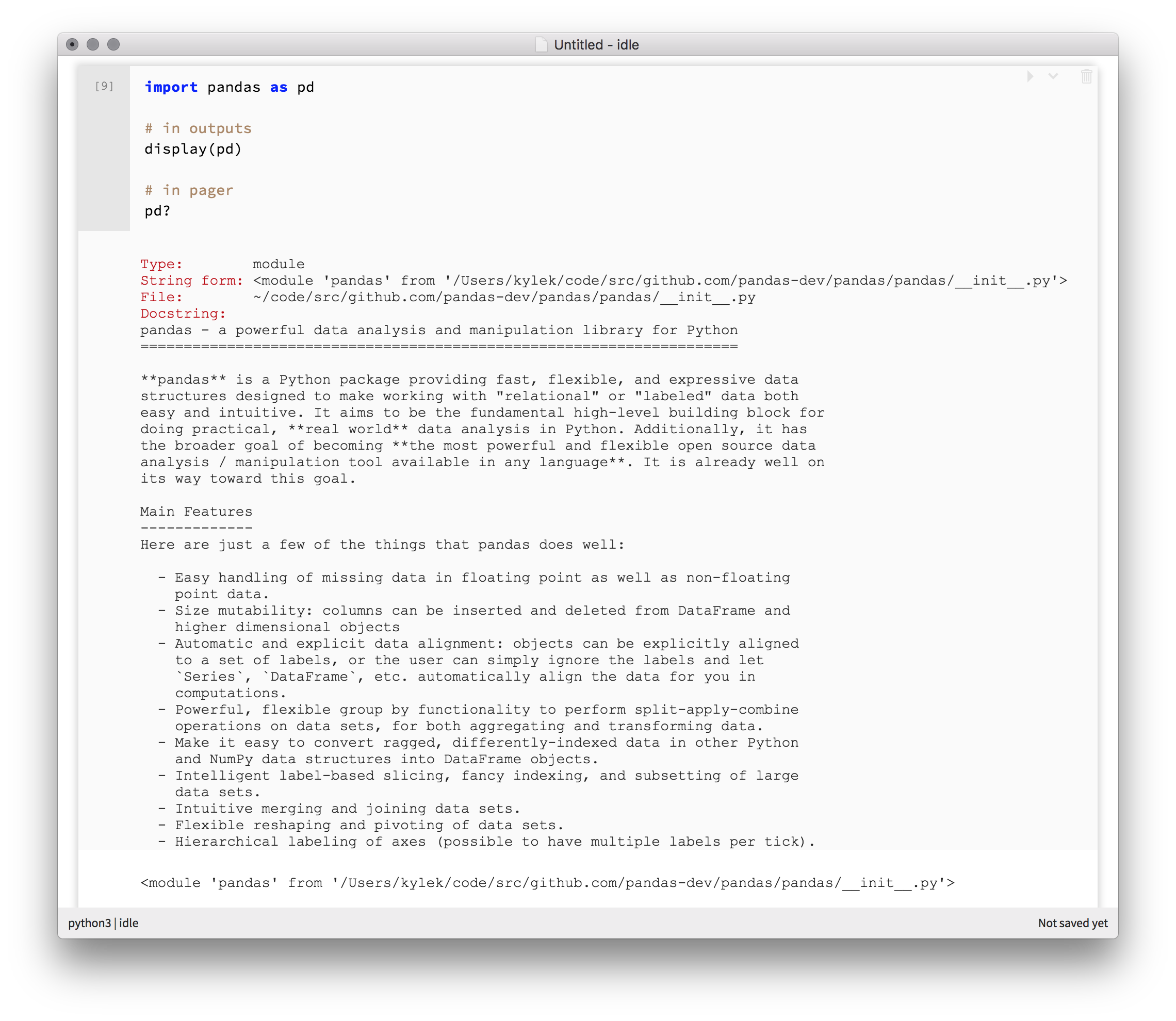
The Pagers component is a container component that serves as the container for the pagers of a cell. Pagers are generally used to display information that is not an output. For example, you might use a pager to display the output of an introspection command like pd?. For an example, take a look at the screenshot below.

A screenshot containing an example of a code cell that uses both outputs and pagers.

You'll generally have both a Pagers component and an Outputs component as part of your notebook cell. Outputs typically contain calculation results or actions on a cell, and Pagers hold information, like help text, found from introspecting a cell.

import { Pagers } from "@nteract/presentational-components"

Similar to other components, the Pagers component provides a hidden flag that determines whether or not the contents of the component should be rendered. You can try it out below by toggling the value of the hidden prop in the code from false to true.

This is a pager.

Since Pagers are displayed alongside Outputs, you'll notice that the background color of the Pagers component is slightly different to distinguish between the two.

import Prompt from '@nteract/presentational-components/src/components/prompt';

The Prompt component is typically a child of the Input component and serves two purposes. First, it serves as a visual indicator of input entry for end users. Secondly, it allows us to display relevant information about the state of a cell to the end user.

import { Prompt } from "@nteract/presentational-components"

A <Prompt/> component with no props will render an empty set of brackets.

[ ]

You can use the counter prop to pass a number that will be rendered within the brackets. If you're working in the Jupyter ecosystem, this number will likely be the execution_count returned by the Jupyter kernel. This execution_count indicates the ordinal position in which the current cell was executed.

[12]

You can use the running prop to indicate that an execution is underway for the current cell. This will render an asterisk ("*") in between the brackets to indicate the in-progress execution to the user.

[*]

You can use the queued prop to indicate that a cell is queued for execution. You'll probably end up using this to facilitate "Run all cells" functionality within your notebook front-end.

[…]

Pass the blank prop to create a prompt with no brackets or other indicators. This is used for Markdown cells through the <PromptBuffer /> component.

import Source from '@nteract/presentational-components/src/components/source';

The Source component is a container component that renders syntax highlighted source code.

import { Source } from "@nteract/presentational-components";

If the child component passed to Source is a string, it will automatically be rendered using nteract's internal source code highlighter.

import python

print("Hello from nteract.")

To define the language that you'd like to use when highlighting source, you can use the language prop. Under the hood, the Source component uses the Prism syntax highlighter. You can view the full list of languages supported by this highlighter to determine what value you should pass to the language prop based on your needs.

You can pass the text/x-{languageName} format to the langauge prop. This is designed to make it easier to interact with the language_info.mimetype property contained in the Jupyter Notebook format.

import org.apache.hadoop.fs.Pathorg.apa
import com.netflix.iceberg.hadoop.HadoopTables
import com.netflix.iceberg.spark.SparkSchemaUtil

val path = "hdfs:/tmp/tables/job_metrics_tmp"

{ // use a block to avoid values (conf, etc.) getting caught in closures

    // remove the temp table if it already exists
    val conf = spark.sparkContext.hadoopConfiguration
    val fs = new Path(path).getFileSystem(conf)
    fs.delete(new Path(path), true /* recursive */ )

    // create the temp table using Spark utils to create a schema and partition spec
    val tables = new HadoopTables(conf)
    val schema = SparkSchemaUtil.schemaForTable(spark, "default.job_metrics")
    val spec = SparkSchemaUtil.specForTable(spark, "default.job_metrics")

    tables.create(schema, spec, path)

    // show the schema
    tables.load(path).schema
}

You can use the className prop to add your own CSS-based styles to the highlighted source.

Bring your own editor

You can pass React component(s) inside of <Source /> to provide your own editor. For example, here we use a styled textarea to render some Python text.

NOTE: The notebook apps use this method to pass the Codemirror editor as the child.

Since this component is just a wrapper to keep styling consistent, you can pass all the onChange handlers you want to your own component.

import DisplayData from '@nteract/outputs/src/components/display-data';

The DisplayData component is a container component used to render rich media elements like images and HTML. This component acts as a simple switch on a set of rich media components. For example, we can define a component Plain that is responsible for rendering data with the text/plain media type and another component Smooth for rendering data with the text/smooth media type.

If you view the source, you'll notice that the component correctly rendered the text/plain data using the Plain component.

Jackfruit is the best food.

You'll most likely end up using this component in conjunction with the Media components described here.

import ExecuteResult from '@nteract/outputs/src/components/execute-result';

The ExecuteResult component is a container component that is used to render data returned by the kernel. The returned data may be in a number of output formats. Similar to the DisplayData component, the ExecuteResult component acts as a simple switch over its children and correctly associates the media type of the returned data with the media type that a component supports.

Why do so many component employ this pattern? It's in the interest of readability. Although each component executes the same logic under the hood, the separation of components by output types allows you to write meaningful JSX from these React components.

Jackfruit is the best food.
import KernelOutputError from '@nteract/outputs/src/components/kernel-output-error';

The <KernelOutputError /> component will render a Jupyter error, commonly done as a traceback. An old error style that is still sent by kernels is the ename and evalue. Per the Jupyter Messaging Protocol, the kernel will return the following payload if it encountered an error during the execution of a code cell.

{
   'status' : 'error',
   'ename' : string,
   'evalue' : string,
   'traceback' : string[],
}

The ename property contains the name of the error (OutOfMemory or NameError). The evalue property contains the value of the error. This is usually the first line you see before the complete traceback. The traceback property contains the stacktrace of the error as a list of strings, with each string consisting of a line within the stacktrace.

We provide a special KernelOutputError component that will allow you to render the error payloads received from the kernel. You can pass the ename, evalue, and traceback property values to render the error and traceback in a clean format.

Tracebacks usually include the ename and evalue at the bottom in python tracebacks. Hence we currently only render the traceback.

--------------------------------------------------------------------------- NameError Traceback (most recent call last) <ipython-input-2-e818d3730d2b> in <module>() ----> 1 asdfaljsd NameError: name 'asdfaljsd' is not defined

With no traceback, the ename and evalue is used. This is common in older versions of this output type.

NameError: Yikes!
import Output from '@nteract/outputs/src/components/output';

The Output element takes a single output prop and several child components and renders the appropriate components to render each output type.

For example, we can create a stream output and use the Output and StreamText components needed for each output type.

Hello World How are you?

Errors returned from the connected Jupyter kernel can be rendered.

Yikes, never heard of that one!

The examples above are simple but we can use Output and our Output-related components to render even more complex structures. In the example below, we have an output that consists of a variety of output types such as stream and data display outputs. By passing the correct output and media types and passing their matching components as children, we can render a variety of outputs.

Hello World How are you?O____O

This is some HTML.

Pretty good I would say

This structure also allows you to create your own components to override how a given output type is rendered. Below is an example that overrides the component to support display_data output types with a component that always renders the same thing.

MyDisplayData.

MyDisplayData.

If your app handles both display_data and execute_result output types in the same manner, you can pass an output_type array instead of a string.

This is an execute_result HTML output that WILL render

import Prompt from '@nteract/outputs/src/components/prompt';
import RichMedia from '@nteract/outputs/src/components/rich-media';

I pick the richest to render!

For further information on the <RichMedia /> component, keep reading! 👓 📚

Media Bundles

Jupyter kernels are able to emit rich media like images, json, text, html, and many others. They're the core of what makes notebooks and consoles so expressive. They're sent over the jupyter messaging protocol and stored in the notebook just like this:

{
  "text/plain": "SparkContext ⚡️",
  "text/html": "<b>SparkContext ⚡️</b>",
  "application/json": {
    "spark": "awesome ⚡️",
    "version": 2
  }
}

This object structure is called a media bundle (formerly known as a mimebundle), so dubbed because it's a bundle of media types and associated data. Jupyter frontends pick the richest media type amongst these for rendering for the user, by selecting via a display order.

As an example, if the display order is:

["text/html", "application/json", "text/plain"]

Then the frontend will prefer HTML instead of JSON and JSON over plaintext. To render any one of these, we write a React Element that takes at least the prop data:

const Plain = props => <pre>{props.data}</pre>;

Plain.defaulProps = {
  mediaType: "text/plain"
};

They can also accept metadata if there is additional configuration allowed. Take for example images which allow setting the size via metadata:

const ImageMedia = props => (
  <img
    alt=""
    src={`data:${props.mediatype};base64,${props.data}`}
    {...props.metadata.size}
  />
);
ImageMedia.defaultProps = {
  mediaType: "image/png"
};

There are several different jupyter message types that include these objects:

Displaying Rich Media with <RichMedia />

The <RichMedia /> component accepts the whole media bundle from a kernel via the data prop and all the elements for rendering media types as children. The order of the children states their richness from highest to lowest.

const Media = require('./media')

<RichMedia data={{ "text/plain": "SparkContext ⚡️" }}>
  <Media.HTML />
  <Media.Plain />
</RichMedia>

The <RichMedia /> component will pass the appropriate data from the media bundle to the element that accepts the media type. In this case, <Plain /> is picked as the richest since text/plain is the only available. "SparkContext ⚡️" is passed as <Plain data="SparkContext ⚡️" /> to render the richest media.

SparkContext ⚡️

Whereas this output has a richer HTML output:

HTML is so rich

Without any valid choices, it renders nothing!

Passing Props

Since the children are React elements, we can pass custom props that will get rendered with the data:

Big Happy Day

Small Happy Day

Which means that you can customize outputs as props!

123
456

Handling Errors from <Media /> components

The <RichMedia /> component comes with a built-in componentDidCatch fallback. To spare this style guide from being spammed with errors, we're not showing the error. To trigger it, uncomment the throw new Error line after clicking "View Code"

Click View Code below to edit

You can override the error formatting by passing a render callback as renderError. It takes all the props that <RichMedia /> itself takes. As an example, here's a component that auto-creates an issue based on the data.

Click View Code below to edit

⚠️ this.props.data can contain sensitive data, so be mindful of what you enable for automatically populating an issue with ⚠️

import StreamText from '@nteract/outputs/src/components/stream-text';

The Jupyter kernel will return outputs that contain data from standard out or standard error using the stream message type. The data contained in this messages consists of a string containing the contents of the output. To render these types of outputs from the kernel in your own Jupyter front-end, you can use the StreamText component.

The StreamText component takes a text prop which contains the contents of the stream. The name prop, which can be one of stdout or stderr dictates whether the text stream originated from standard out or standard error respectively.

hello world

You can access components for a variety of media types, like HTML and JSON, under this set of Media components.

import Html from '@nteract/outputs/src/components/media/html';

HTML, or HyperText Markup Language, is markup language used for create web pages and web apps. The Media.HTML component allows you to render raw HTML in your nteract contexts. To use the component, you'll need to the pass the HTML that you would like to render in string form to the data prop, like so.

This is some HTML code.

Under the hood, this component renders your HTML string as if it originated from the rendered context. This is accomplished by creating a Range object, which represents an arbitrary part of the contents of an HTML document. For example, Range objects are used to represent the portion of an HTML document that a user has selected with their cursor. In this case, the Range is used as the context for a DocumentFragment, which acts as a pseudo-DOM node that contains the contents of the HTML string passed by the user.

import Image from '@nteract/outputs/src/components/media/image';

When images are returned from a kernel, they come back as base64 encoded images as image/png, image/gif, or image/jpeg. One super common example of this is a chart from matplotlib.

The size of the image can be controlled by setting height and width in metadata. Python users typically do this with IPython.display.Image or by directly integrating with IPython's rich display handlers.

For example if a user displayed an image like this, we'd expect this output:

IPython.display.Image(data, height="132px", width="193px")
import Javascript from '@nteract/outputs/src/components/media/javascript';

The Media.JavaScript component allows you to execute JavaScript in the context of the current document.

Check your devtools!

Because of this, you can declare variables in the scope of the current window context. For example, view the source code for the component below.

ReferenceError: this_is_our_special_variable is not defined

Then navigate to your browser's developer console and print out the value of the variable this_is_our_special_variable like so.

console.log(this_is_our_special_variable);
> 10

If you're familiar with the Jupyter ecosystem, note that this component executes JavaScript in a manner identical to Jupyter Notebook's JavaScript evaluation. The code you execute using this component will not persist through reloads, so it's a good place to test and iterate on scripts.

The Media.JavaScript component can also help you when things go wrong by printing an error trace. For example, here's what happens when you attempt to log invoke an undefined function.

ReferenceError: there_is_no_way_this_function_exists_right_now is not defined
    at eval (eval at runCodeHere (https://components.nteract.io/build/bundle.360604c5.js:265:624), <anonymous>:1:1)
    at runCodeHere (https://components.nteract.io/build/bundle.360604c5.js:265:624)
    at JavaScript.componentDidMount (https://components.nteract.io/build/bundle.360604c5.js:265:898)
    at ik (https://components.nteract.io/build/bundle.360604c5.js:506:101028)
    at i.unstable_runWithPriority (https://components.nteract.io/build/bundle.360604c5.js:522:3544)
    at fg (https://components.nteract.io/build/bundle.360604c5.js:506:45561)
    at Yj (https://components.nteract.io/build/bundle.360604c5.js:506:97254)
    at Lj (https://components.nteract.io/build/bundle.360604c5.js:506:87597)
    at Rg (https://components.nteract.io/build/bundle.360604c5.js:506:84173)
    at rk (https://components.nteract.io/build/bundle.360604c5.js:506:112294)

Under the hood, this component executes the JavaScript string passed to data using eval. As such, be sure that whatever data you are passing to the component is coming from a trusted source.

import Json from '@nteract/outputs/src/components/media/json';

JSON, or JavaScript Object Notation, is a popular data format that represents its contents in a human-readable form. JSON consists of a series of attribute value pairs, like name: "Tester McTester".

You can render JSON data into an explorable tree-like structure using the Media.Json component. JSON data is identified using the application/json media type.

    • "Tester McTester"
    • 20
    • "The North Pole"
    • {} 2 keys
      • "Senior Engineer"
      • {} 2 keys
        • "Acme Inc."
        • 1

Any nested JSON data will be rendered in expanded form by default. If you would like to render nested data in collapsed form by default, you can pass the object { expanded: false } to the metadata prop.

    • "Tester McTester"
    • 20
    • "The North Pole"
    • {} 2 keys
    import Latex from '@nteract/outputs/src/components/media/latex';

    LaTeX formula are returned from the kernel using the text/latex media type. @nteract/mathjax is used to typeset the mathematics.

    The well known Pythagorean theorem x2+y2=z2 was proved to be invalid for other exponents. Meaning the next equation has no integer solutions: xn+yn=zn
    import Markdown from '@nteract/outputs/src/components/media/markdown';

    Markdown is a popular markup language for formatting text files. The Media.Markdown component allows you to render Markdown. The default media type used for the Media.Markdown component, and elsewhere on the web, is text/markdown. To render markdown, you'll need to pass the plain-text markup of your Markdown text to the data prop of the component like so.

    Markdown is Awesome!!!

    This component renders Markdown that complies with the Commonmark Markdown specification, so you can use it to render a variety of block and inline formats.

    a code block

    a block quote

    The Media.Markdown component also renders HTML. This ability does expose certain security issues so be sure that whatever content you are planning on rendering with your Media.Markdown component originates from a trusted source.

    You & I

    In addition to HTML, Media.Markdown also allows you to render LaTeX equations within your Markdown as follows.

    Math, like Cprimed=alpha, is pretty cool.

    import Plain from '@nteract/outputs/src/components/media/plain';

    Plain text is....plain. It contains no formatting, images, or interactivity. Its lack of richness doesn't mean there isn't a component for it in the nteract space! You can use the Media.Plain component to render plain text. All you'll need to do is pass the contents of the text to the data prop of the component.

    This text is as plain as can be.

    As it tuns out, although plain text does not contain any formatting. The Media.Plain component will let you format your content using [ANSI escape codes]((https://en.wikipedia.org/wiki/ANSI_escape_code). Here's an example of a piece of text formatted using the escape code for a red color.

    some red text
    import Svg from '@nteract/outputs/src/components/media/svg';

    SVG, or Scalable Vector Graphics, is an image format for two-dimensional graphics that support interactions and animations. SVGs are often represented as an XML-based format, similar to the format below.

    <?xml version="1.0" encoding="UTF-8" standalone="no"?>
    <svg xmlns="http://www.w3.org/2000/svg" width="500" height="500">
    <circle cx="250" cy="250" r="210" fill="#fff" stroke="#000" stroke-width="8"/>
    </svg>

    That's right! Under the hood, SVG images are just plain-text. Their scalability and responsiveness makes them great for rendering charts and graphs. The media type used to refer to SVGs in the Jupyter ecosystem, and elsewhere on the web, is image/svg+xml. To render SVGs, you can use the Media.SVG component. You'll need to pass a data prop that contains the plain-text contents of the SVG.

    import Entry from '@nteract/directory-listing/src/components/entry';
    import { Entry } from "@nteract/directory-listing";

    This component is used to create individual entries in a directory. It is not meant to be used alone, but rather as a child of the Listing component and renders children of its own. In nteract, we use it as the parent of the Icon, Name and LastSaved components in the nteract-on-jupyter and commuter applications.

    In the example below, we use the Entry component to display an icon, name, and time since last save of an entry in a directory.

    NotebookExample-Notebook.ipynb
    import Icon from '@nteract/directory-listing/src/components/icon';
    import { Icon } from "@nteract/directory-listing";

    This component displays an icon for a particular file. The fileType prop can be one of "unknown", "notebook", "directory", "file", "dummy" to render the corresponding icon. Below are examples of each file type icon.

    FileNotebookDirectoryFileFile

    The component also takes a color prop that allows you to change the color of the icon by providing a valid hex, HTML, RGB, or HSL color code. See the source code for the example below to see how you can use the color prop to add some style to your icons!

    FileNotebookDirectoryFileFile
    import Lastsaved from '@nteract/directory-listing/src/components/lastsaved';
    import { LastSaved } from "@nteract/directory-listing";

    The LastSaved component displays the time since the date provide in lastModified in human readable format. The date provided to the lastModified prop should be a valid JavaScript date.

    import Listing from '@nteract/directory-listing/src/components/listing';
    import {
      Entry,
      Listing,
      Icon,
      Name,
      LastSaved
    } from "@nteract/directory-listing";

    The Listing component is a container component to show any listing of directories and files in a tabular layout for users. This component works best with <Entry> for each item in a content listing.

    NotebookGANS-for-days.ipynb
    Directoryhome
    Filecomponent.js
    Fileno-permission-file.md
    import Name from '@nteract/directory-listing/src/components/name';
    import { Name } from "@nteract/directory-listing";

    The Name is a container component can be used to show a stylized name of the file or directory in a listing. Generally, you'll want the child of this component to be a link to the path of the file that you'd like the user to click to open.

    The MarkdownRender component allows you to render Markdown text per the Commonmark specification. It's got one major power-up though, it allows you to render in-line and block math using LaTeX syntax too.

    Under the hood, the component builds upon the open-source ReactMarkdown component. The MarkdownRender component takes all the same props and passes them on to the ReactMarkdown component it uses under the hood.

    If you'd like to learn more about what props you can change, you can read the documentation available on the ReactMarkdown component.

    So, when would you want to use nteract's MarkdownRender component? Quite simply, whenever you need to render Markdown with some math in it. As long as your math is written in valid LaTeX, you can expect to see beautifully rendered math in your user interface.

    To render Markdown using this component, you can pass the Markdown text to the source prop like so.

    Just some deltaalpha math.

    Alternatively, you can pass the source as a child of the MarkdownRender component.

    Some sweet, sweet Markdown.

    The MathJax component provides a way to both load MathJax on the page and render MathJax Nodes. Many people love ❤️ beautifully typeset mathematics, and these components are the way to provide it.

    This is an inline math formula: a=b and a block one:f(x)=ˆf(ξ)e2πiξxdξ

    The components are written in a React 16+ way to both load mathjax through a <Provider /> and render individual MathJax nodes with <Node />. React does the heavy lifting of knowing what changed and the <Node> component triggers having MathJax do what it's good at — typesetting mathematics!

    This semi-contrived example shows

    We should update n1 pieces of a paragraph without triggering a MathJax re-render.

    If you use <Node /> with no provider, a <Provider /> is created for you automatically.

    a=b