English | 简体中文
Asri is a modern theme designed for SiYuan Note, crafting a space where visual distractions disappear and your thinking takes center stage - immersive, focused, and intuitively guided.
⚠️ Some devices may experience abnormal color calculation in recent Chromium versions, resulting in excessively high brightness and saturation of theme colors. If you notice such color issues, please go toSettings - Appearance - Code Snippets, add and enable the following CSS snippet as a temporary fix:/* Light mode */ :root[data-theme-mode=light] { --ccff: 0.5; /* 0-1 reduces brightness and saturation, >1 increases brightness and saturation */ } /* Dark mode */ :root[data-theme-mode=dark] { --ccff: 0.5; /* 0-1 reduces brightness and saturation, >1 increases brightness and saturation */ }
To view the details of the latest release, please visit the Releases Page.
For the complete update history, refer to the CHANGELOG.md.
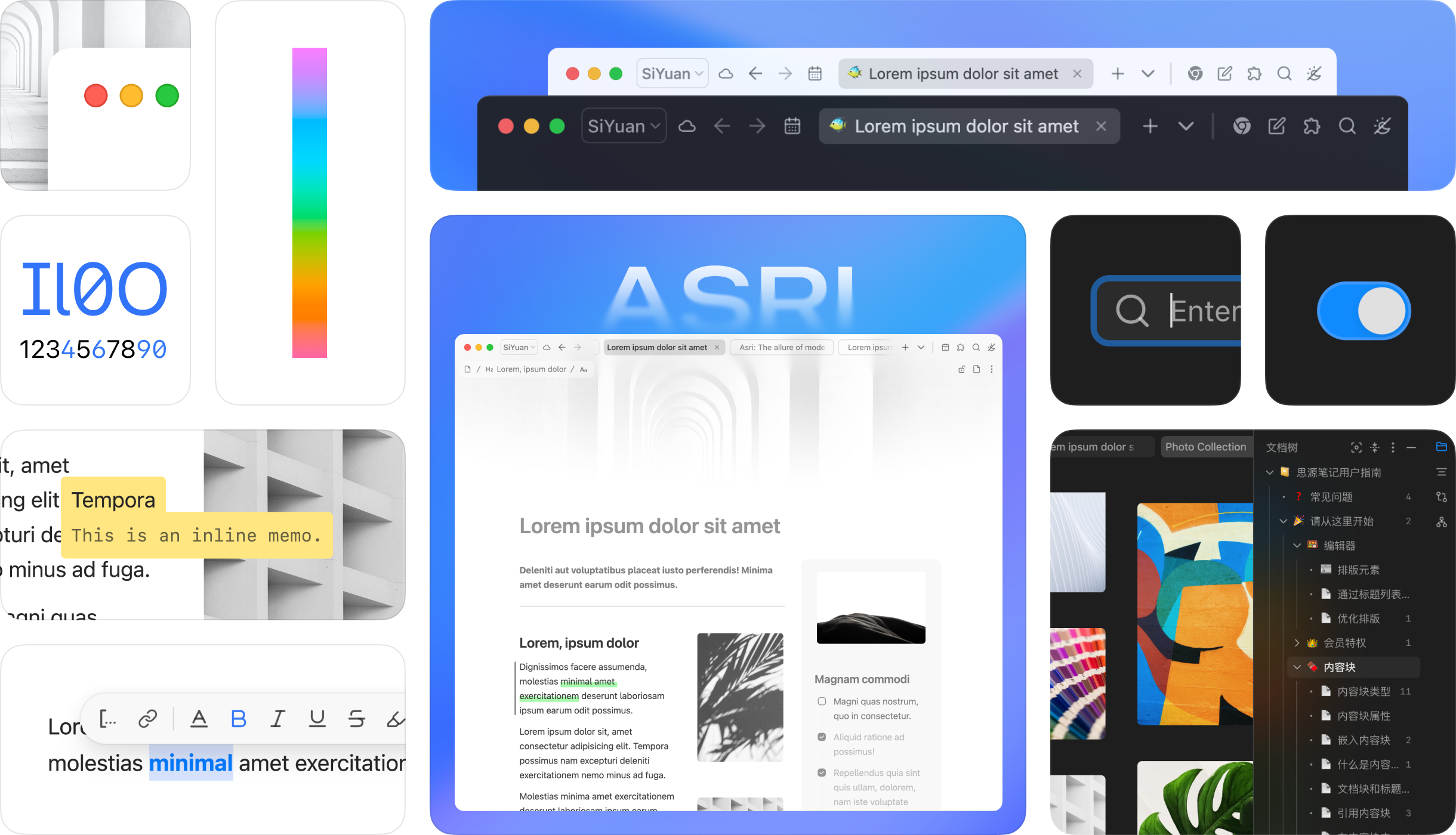
Theme colors now support "Follow cover image color", automatically extracting colors from document cover images or videos and switching theme colors in real-time.

v3.5.4 introduces HDR UI components, presenting a more futuristic and tech-inspired design in HDR-supported screens and browser environments (automatically enabled when the theme chroma is 0).
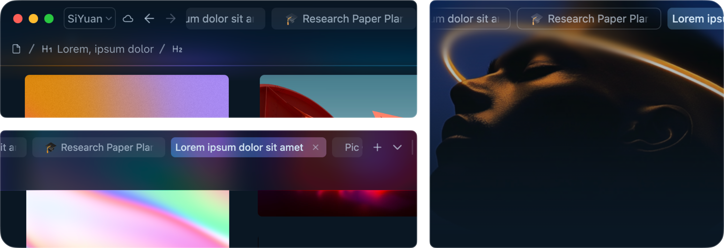
"Topbar Fusion+": Introduced advanced material effects (luminous glass, progressive blur, acrylic), breaking the boundary between the top bar and the editor for an immersive reading and editing experience (experimental feature; enable with caution - see Footnote 3 for details).

Refactored theme colors using a perceptual lightness-based color system, added supports for seamless adjustment of global color tones which can also follow system accent color (#Windows #macOS), providing a fully personalized note-taking experience.
More Content
"Asri Full-width Display": implementing full-page width display of images, videos, widgets, superblocks, and database blocks, etc
"Tabbar Fusion": introduced a new top bar design seamlessly integrated with the tab bar, balancing aesthetics and efficiency
Theme release
- 👨🎨 continuously adjustable theme color customization, crafting a highly personalized note space for you1
- 🎨 Color scheme based on human brightness perception for harmonious, non-intrusive visuals
- ⚖️ Topbar Fusion+ seamlessly integrates the top bar, the tab bar and the editor23
- 🧊 Glassmorphism enhances the visual hierarchy
- 🌓 Support for light and dark modes and smooth transition between them
- ➖ Minimized dividers create an integrated, cohesive interface style
- 🔢 Tabular and database-friendly monospaced numerals improve reading efficiency
- 👁️ High readability glyph variants tailored for note-taking scenarios4
#macOS#iOS#iPadOS - 🦋 Support for full-width display of images, videos, widgets, databases, superblocks and more, enhancing information display
- 🧩 Streamlined superblock margins for simplified creation of grid and masonry layouts
- 📝 Enhanced the layout details in database and attribute view for improved clarity and organization
- 💬 Supports right-to-left layout, accommodating languages written from right to left, such as Arabic5
- 🚏 Document-level typography direction settings cater to different language layout needs
- 🌐 Multi-language support, specially adapted for Chinese, English and Arabic
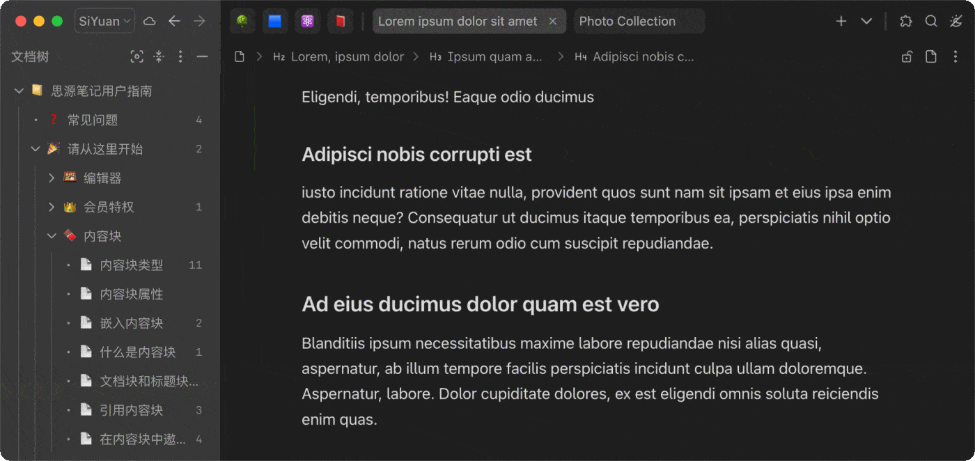
- 🗂️ Well-structured document tree and indentation guide lines to help you quickly grasp content hierarchy
- 🔍 Hierarchically organized search and backlink panels for intuitive contextual tracing and associative thinking
- 🎯 Focus block indicators guide attention flow and enhance coherent output of thought sequences
↕️ Native system scrollbars with auto-hide for a cleaner and more natural interface6#macOS
- 💫 Carefully tuned lively animations add warmth and rhythm to interactions
- ⏱️ Refined animation triggers and frequency enhance interface response rhythm and minimize attention drift
- 🚀 High-performance global animations ensure uninterrupted immersive experience
- 🌁 Global gradient fades soften element edges and reduce visual fragmentation
- 🌄 Parallax scrolling for header images, creating a layered and minimalist spatial atmosphere
- 🛋️ Optimized font rendering strategies per light/dark mode to maintain consistent perceived weight
#macOS#iOS#iPadOS - 🚥 Subtle repositioning of window control buttons for enhanced native system alignment
#macOS
- Download & update in SiYuan (recommended): Go to
Settings - Marketplace - Themesin SiYuan and search for "Asri" to download and apply. - Download & update from GitHub: Download the
package.zipfrom releases, extract it toconf/appearance/themesin your SiYuan workspace, and restart SiYuan. Then choose "Asri" in your theme list inSettings - Appearance.

Click on the Appearance Mode icon in the top right corner to open the Asri theme configuration menu and customize the theme colors:
Customize theme color: Use a custom color as the base color for the theme and apply a corresponding color scheme directly based on it.Follow system accent color: Use the system's accent color as the base theme color. This option is available onWindowsandmacOSdesktop platforms.Follow cover image color: Extract color from the cover image (image, video) of the current active document as the theme base color.Chroma slider: Adjust the chroma of backgrounds and regular texts, with a range of0 - 5, where0represents pure grayscale, and the default is1.
This attribute allows blocks to be displayed in full page width, which can be used to emphasize specific content or beautify the layout. The full-width display style applies to images, databases, iframes, tables and horizontal-layout superblocks.
To enable full-width display, you can click on the block icons for Document Block and the content block mentioned above, then select Full-width Display in the popup menu to configure it accordingly.
- Full-width display only applies to the first-level blocks in the document. If a block is nested in other content blocks, applying this attribute to it will not produce any effect. For example, applying this attribute to an image paragraph block in a blockquote will not change the style of the paragraph block unless the external blockquote is cancelled.
- Full-width display is only effective in the editing area of the main window and small windows, and does not work in block reference preview windows, export previews, backlink panel, search result previews, etc.
- Enabling full-width display may cause the page to feel more jumpy when the editing area's size changes and automatically returns to the cursor position.
More Details
This feature relies on the custom attributes of SiYuan, so you can also manually configure the block attributes. The attribute name and values are shown in the table below:| Attribute | Value | Description |
|---|---|---|
afwd |
- all (Makes all blocks that support this attribute in the document display in full width)- p (Makes all images in the document display in full width)- db (Makes all database blocks in the document display in full width)- iframe (Makes all iframe blocks in the document display in full width, including videos, widgets, and embedded web pages)- sb (Makes all horizontal-layout superblocks in the document display in full width)- t (Makes all table blocks in the document display in full width) |
Applies to document blocks. All attribute values except all can be used simultaneously, and should be separated by spaces |
afwd |
- on (Enable full-width display of the block individually)- off (Disable full-width display of the block individually) |
Applies to paragraph blocks, database blocks, iframe blocks, superblocks and table blocks. |
Applies exclusively to document blocks, ensuring that content within the block is consistently rendered from left-to-right or right-to-left for ease of writing and reading. This property is independent of global settings and does not override individual layout settings of blocks within the document. This attribute does not take effect in backlink lists and export previews.
To apply this property to a document, you can click on the block icon for Document Block, then select Doc layout direction in the popup menu.
More Details
| Attribute | Value | Description |
|---|---|---|
tdir |
ltr |
Renders document content from left to right, ideal for left-to-right languages like Chinese and English. |
tdir |
rtl |
Renders document content from right to left, ideal for right-to-left languages like Arabic. |
The theme’s early development drew inspiration from the following sources, for which I would like to express my gratitude to their authors:
| Reference Content | Source | Author |
|---|---|---|
| - Menu background blur | Theme: Cliff-Dark | Crowds21 |
| - Dots before sidebar panel list items - Outline list item icons - Status bar - Seach list - Table column width - Multi-column / menu- Bottom dock & status bar mergence - Multilevel list style |
Theme: Savor | Roy |
| - Topbar-tabbar mergence - File tree indent guides - MutationObserver related functions |
Theme: Rem Craft | Seven Chord |
- Create an issue or PR at the project page
- Send an email to mustakshif@icloud.com
Footnotes
-
This new feature is only available on platforms that support
oklch()and its relative color syntax. Some devices will still use color schemes in previous versions due to lower browser kernel versions. ↩ -
The blank area of the top bar can be used to drag the window (except for the gap between tabs). ↩
-
Topbar Fusion+ introduced significant adjustments to the native styling of SiYuan Notes. Despite undergoing extensive stability testing, full stability cannot be guaranteed, and it may remain an experimental feature for an extended period. Currently known issues include:
- The dynamic scrollbar on the right side of the editor failed to display document progress in real time (jump functionality remained normal)
- Automatic scrolling could not be triggered when dragging blocks toward the top of the page
- Database headers could not remain fixed within the editor's visible area
Additionally, it might cause other issues such as:
- Conflicts with custom styling code
- Compatibility problems with certain plugins
- Reduced readability of top bar texts/icons
- Decreased page performance
If any issues are encountered during use, please disable this feature promptly. ↩
-
To disable this feature or address glyph errors when using custom fonts, you can use the following CSS code snippet to restore to standard glyphs:
↩.layout-tab-container, .protyle-content, .b3-typography { font-feature-settings: normal !important; } -
Due to the limited theming functionality, the UI layout direction of some interfaces cannot be fully modified. ↩
-
To automatically hide the scrollbars, go to "System Settings - Appearance" and set "Show scroll bars" to "When scrolling". ↩