-
在思源笔记中使用—时间轴 timeline
2025-06-11 09:44这个是夜间模式的样式:

代码部分:
<div class="timeline"> <!-- 时间节点 --> <div class="timeline-item"> <div class="timeline-dot"></div> <div class="timeline-content"> <p class="post-date">2025-06-05 13:36</p> <div class="timeline-description"> 遇事不决 ,可问春风 </div> </div> </div> <!-- 时间节点 --> <div class="timeline-item"> <div class="timeline-dot"></div> <div class="timeline-content"> <p class="post-date">2025-06-05 13:36</p> <div class="timeline-description"> 人间最得意 ,白也诗无敌 </div> </div> </div> </div> <!DOCTYPE html> <html lang="en"> <head> <meta charset="UTF-8" /> <meta name="viewport" content="width=device-width, initial-scale=1.0"/> <title>Timeline</title> <style> body { font-family: -apple-system, BlinkMacSystemFont, "Segoe UI", Roboto, "Helvetica Neue", Arial, sans-serif; } .timeline { position: relative; max-width: 1200px; margin: 0 auto; padding: 20px 0; } .timeline::before { content: ''; position: absolute; width: 3px; background-color: #ff69b4; top: 0; bottom: 0; left: 15px; } .timeline-item { margin-bottom: 40px; position: relative; } .timeline-dot { position: absolute; left: 6px; /* 调整位置使其更贴近图片样式 */ top: 10px; width: 12px; height: 12px; background-color: #ff69b4; border-radius: 50%; z-index: 1; border: 2px solid white; /* 添加白色边框 */ } .timeline-content { margin-left: 30px; } .post-title { font-size: 16px; font-weight: bold; margin-bottom: 20px; color: #78ADFF; margin-left: 25px; } .post-date { font-size: 14px; color: #bfbebe; margin-bottom: 10px; font-weight: 600; } .timeline-description { background-color: #ff69b445; padding: 15px; border-radius: 8px; color: #e7e7e7; line-height: 1.6; } </style> </head> <body> </body> </html> -
VSCode Lite Edit 主题 2.3.0 版本更新说明
2025-06-10 14:27好的 ,谢谢答复 ,我应该晚上的时候看错了 ,现在差不多知道怎么去修改了 ,还有就是我想改下这个左侧边的弯曲程度请问要怎么去修改啊 ,我想把上面的部分改成下面的这种形式
-
VSCode Lite Edit 主题 2.3.0 版本更新说明
2025-06-08 00:34感觉标题部分进行加粗的话会比较好看点 , 还有图标的大小设置为 1.2em(个人观点)
然后就是我想改成下面图中所示的样式 ,但是这个竖线的弯曲程度好像改变不了 ,我改了下
border-radius的数值并没有什么反应 ,大佬可以帮忙提供下代码嘛还有就是我想改一下默认的这个引述块而不影响其他的引述块的 callout 样式 ,这个要怎么去修改啊
-
写味主题代码块美化
2024-10-05 21:32这个就不清楚了 ,因为很久不使用这个代码块了 ,如果你只是想拥有 mac 风格的代码块的话 ,可以改成这个试一下
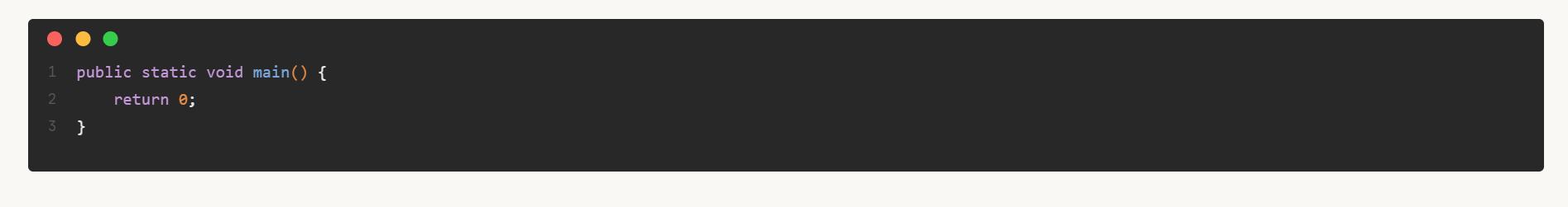
/*语言提醒*/ .b3-typography .code-block .protyle-action .protyle-action__language, .protyle-wysiwyg .code-block .protyle-action .protyle-action__language { font-size: 85%; color: white; margin-top: -4px; padding-left: 2.5em; } /* 设置顶部三个mac按钮样式 */ .code-block::after { content: ' '; position: absolute; background: #fa625c; box-shadow: 23px 0 #fdbc40, 45px 0 #35cd4b; border-radius: 7px; top: 10px; left: 15px; height: 12px; width: 12px; z-index: 1; } -
基于 Savor 主题的文档树样式
2024-09-23 18:33基于 Salt 配色的样式
/* 修改 文档树 大纲 收集箱 文字的颜色 */ .block__logo { color: var(--b3-block-logo-color); } /* 取消文档树、大纲、反向链接左边的icon,感觉显示重复了 */ .block__logo svg { display: none; } /* 文档树、大纲、反向链接顶部的背景颜色 */ div[data-type="wnd"] .block__icons { background-color: var(--b3-theme-surface); /* border-bottom: 2px dashed var(--b3-border-color); */ } /* 文档树引用数字的颜色 */ .counter { color: var(--b3-counter-color); } .counter:hover { background-color: transparent !important; } /* 无子文档的文档前面添加符号 */ .b3-list-item.b3-list-item--hide-action .b3-list-item__toggle.fn__hidden::before { content: "◦"; font-size: 2em; position: absolute; visibility: visible; margin-bottom: 2px; color: #8080804d; } /* 设置文档树前面的>符号颜色 */ .fn__flex-1.fn__flex-column.file-tree .b3-list-item__arrow { color: #8080804d; } /* 点击文档树emoji不弹出修改窗口(防止误触) */ /*span.b3-list-item__icon.b3-tooltips.b3-tooltips__n { pointer-events: none; }*/ /* 笔记本之间的间隔 */ .sy__file ul.b3-list.b3-list--background { border-radius: 1px; margin: 6px 4px 6px 14px; outline: 1px solid rgba(231, 231, 231, 1); background-color: rgb(215, 224, 224) !important; box-shadow: rgba(0, 0, 0, 0.05) 0px 6px 24px 0px, rgba(0, 0, 0, 0.08) 0px 0px 0px 1px; } [data-type="navigation-root"] { height: 32px; } /* 给文档树,大纲设置背景颜色 */ .fn__flex-1.fn__flex-column.file-tree:not(.file-tree .sy__file) { background-color: rgb(215, 224, 224) !important; } .sy__file>.fn__flex-1 { background-color: rgb(215, 224, 224) !important; } /* 设置反链面板图标位置(不设置对不齐) */ .backlinkList.fn__flex-1 .b3-list-item .popover__block { margin-left: 4px; } /* 文档树item */ /* 抵消v2.4.1α的影响 */ .b3-list-item { margin: 0px !important; } .b3-list--background .b3-list-item { border-radius: 0px; } /* ------------------------------------文档树文字设置为灰色------------------------------- */ .b3-list-item__text { color: var(--b3-theme-on-surface); } /* -----------------------------文档树focus------------------------------- */ /* 颜色 */ .b3-list--background .b3-list-item--focus .b3-list-item__text, .b3-list--background .b3-list-item--focus .b3-list-item__graphic, .b3-list--background .b3-list-item--focus .b3-list-item__icon svg { color: var(--b3-theme-primary); } /* 背景 */ .b3-list--background .b3-list-item--focus { background-color: var(--b3-theme-tm2) !important; } /* -----------------------------文档树hover-------------------------------- */ /* 颜色 */ .b3-list--background .b3-list-item:hover .b3-list-item__text, .b3-list--background .b3-list-item:hover .b3-list-item__graphic, .b3-list--background .b3-list-item:hover .b3-list-item__icon svg { color: var(--b3-theme-on-surface); } /* 背景 */ .b3-list--background .b3-list-item:hover { background-color: var(--b3-theme-tm-gray) !important; } -
求一段外观面板中「颜色」样式修改的 CSS 代码
2024-09-16 11:44这个是 Savor 主题上的 ,其他的主题没试过 ,你可以看下有没有效果
:root{ /* 卡片背景 */ --b3-card-error-color: rgb(97, 26, 21); --b3-card-error-background: rgb(238, 213, 210) !important; --b3-card-warning-color: rgb(102, 60, 0); --b3-card-warning-background: rgb(243, 225, 200) !important; --b3-card-info-color: rgb(13, 60, 97); --b3-card-info-background: rgb(204, 223, 237) !important; --b3-card-success-color: rgb(30, 70, 32); --b3-card-success-background: rgb(217, 239, 217) !important; } -
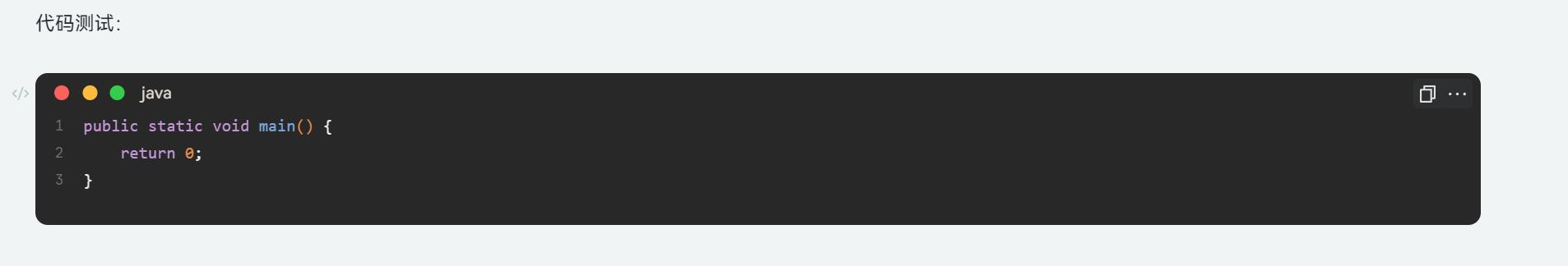
写味主题代码块美化
2024-09-12 13:45抱歉 ,这个好久不怎么使用了 ,现在这个是临时调的 ,基于 Savor 主题 Salt 配色 ,希望能帮助到你
pre code.hljs {
    display: block;
    overflow-x: auto;
    padding: 1em
}

code.hljs {
    padding: 3px 5px
}

.hljs-comment,
.hljs-quote {
    color: #969896
}

.hljs-deletion,
.hljs-name,
.hljs-regexp,
.hljs-selector-class,
.hljs-selector-id,
.hljs-tag,
.hljs-template-variable,
.hljs-variable {
    color: #d54e53
}

.hljs-built_in,
.hljs-link,
.hljs-literal,
.hljs-meta,
.hljs-number,
.hljs-params,
.hljs-type {
    color: #e78c45
}

.hljs-attribute {
    color: #e7c547
}

.hljs-addition,
.hljs-bullet,
.hljs-string,
.hljs-symbol {
    color: #b9ca4a
}

.hljs-section,
.hljs-title {
    color: #7aa6da
}

.hljs-keyword,
.hljs-selector-tag {
    color: #c397d8
}

.hljs {
    background: #000;
    color: #eaeaea
}

.hljs-emphasis {
    font-style: italic
}

.hljs-strong {
    font-weight: 700
}

/* 代码块背景设置 */
.b3-typography .code-block:not(pre), .protyle-wysiwyg .code-block:not(pre) {
    padding: 2em 1em 1.6em;
    margin: 1em 0;
    box-sizing: border-box;
    background-color: #282828;
}

.code-block::after {
    content: ' ';
    position: absolute;
    background: #fa625c;
    box-shadow: 23px 0 #fdbc40, 45px 0 #35cd4b;
    border-radius: var(--b3-border-radius-round);
    top: 10px;
    left: 15px;
    height: 12px;
    width: 12px;
    z-index: 1;
    border-radius: 6px;
}


.b3-typography .code-block:not(pre) .protyle-action .protyle-action__language, .protyle-wysiwyg .code-block:not(pre) .protyle-action .protyle-action__language {
    font-size: 85%;
    color: #fff8ed;
    margin-top: -4px;
    align-self: center;
    margin-left: 75px;
}

.code-block .protyle-action .protyle-action__copy, .code-block .protyle-action .protyle-action__menu {
    margin-top: -3px;
    color: #fff;
    background-color: var(--S-list-background);
}